First, a little context
About Scaler
Scaler is a technology education platform that helps working professionals build industry-relevant skills through structured programs, mentorship and career support.
Overview
Every Scaler learner gets a mentor from a tech company who guides them through the program. Mentorship is one of the three things Scaler sells, alongside teaching assistants and placement support. I redesigned how a learner gets that mentor in the first place.
My role
I owned this end to end: the research, the concept, the design and the handoff. Ash was the design stakeholder, giving direction and feedback at review. Rashmi shaped the hybrid mentorship concept.



Outcomes
~50%
Drop in support tickets in the first month after launch
234 in May 2023 to 112 in June, and 21 by July.
91%
Of mentees selected their own mentor
In Academy as of June 2023. Previously, Ops were heavily driving this initiative.
34% → 27%
Refund requests raised on Academy
At roughly ₹2.5L a program, 7 fewer refunds in every 100 learners is about ₹17.5L retained. Bug fixes and comms shipped alongside.
What is the goal of
mentorship at Scaler?
Before getting into the design work, it helps to know what mentorship was actually meant to do for the business, which Scaler framed in two halves.
01
Primary
- Ensure qualitative and quantitative impact on a learner's journey, from day 0 until the last day of placement, through mentorship.
02
Secondary
- Use mentorship as a hook to reduce refunds at the start of the program.
- Set the narrative so learners are intrinsically motivated to complete the action items Scaler currently has to enforce.
The secondary goals are the ones I was actually designing against.
Scaler had already tried two ways
of giving a learner a mentor
So before getting into what I designed, here is how learners used to end up with a mentor.
1. Very Old Model
In this model, a list of mentors was shown in the learner's dashboard, from which one could pick a suitable mentor. This happened when the mentee was onboarded to Scaler.
Problems identified
- This mentor selection process felt like a “Fastest Fingers First” approach.
- There was discontent amongst learners during the mentor selection process.
- No narrative around the importance of mentorship and also why a learner should stick with a particular mentor.
2. Old Model
In this model, Scaler nudged the learner to book a mentor session as a part of the mentee onboarding journey. The mentor was assigned during the mentor session booking flow, matched based on the learner's profile (ex: YOE, batch, etc).
Problems identified
- Lack of transparency around how a mentor was chosen as suitable for a mentee.
- No option was provided for the mentee to choose a mentor.
- The mentor sessions were becoming too transactional.
- No narrative around the importance of mentorship and also why a learner should stick with a particular mentor.
“The leadership team proposed a ‘New Model’ as a solution to address the shortcomings observed in the previous two models.”
Introducing Hybrid
Mentorship Model
It is called hybrid because it takes one half from each of the models that came before it. The system still does the matching, using the background and career aspirations the learner gives us, but the learner makes the final call from that matched set, which is something neither of the old models let them do.
Goals of the project
- To place mentorship as a key USP to the learners and make it a core part of onboarding.
- To set the narrative around why mentorship is important and how your mentor will stay with you to guide you throughout the program.
- To provide more control for the mentees to choose their mentors.
So I took a step back, and went back to the team
Before I designed anything, I sat down with the team and brainstormed, and we talked through why this piece of the journey mattered in the first place.
- I tried to understand the first-time experience of other products.
- I pulled the mentorship research I had run as part of the UXR team, where learners gave their own insights on mentor selection.
- I sat with the first-time-experience team and went through the refund numbers with them.
What came out of it
As per our UXR, learners are still not convinced about ROI and value proposition. Scaler's USP is placements, mentorship and instructors, so we should improve those to justify it.
What came out of it
Around 40% of refunds are before the meet and greet session, so improving mentor selection would be very effective, as that is something learners do before meet and greet.
What came out of it
Learners wanted to understand why a particular mentor had been chosen for them. The transparency they were asking for was missing.
What came out of it
Learners wanted to choose mentors from specific companies, and from backgrounds close to their own.
Two directions went to review
and both lost
Iteration 1: a dedicated page with a starter guide
A three-step process where a learner could understand mentorship, select their preferred mentor and then book a session. There was also a banner with a “Schedule 1:1 Mentor Session” CTA that let them skip the whole thing, plus an FAQ section for initial queries.
Iteration 2: the same journey, compressed into a modal
The same three steps, but layered over the dashboard instead of pulling the learner away from it. Career aspirations first, then a grid of mentor cards with ratings, then scheduling.
After many brainstorming sessions,
this is what I designed
1. Narrate the importance
The previous two versions opened with a video explaining mentorship, and learners kept skipping it, so the argument for mentorship never really landed.
Basis the feedback, I removed the video and replaced it with an actual learner testimonial. These are alumni from the learner’s own batch, which strengthens the case for picking a mentor and for why mentorship matters in the first place.
Why it was built this way
- On the right side, you can find a concise overview of how mentors at Scaler assist mentees, along with helpful suggestions for scheduling sessions.
- To validate the pitch, I used testimonials by past mentees and focused on which areas did the mentor help the mentee.
- Also to drive up the CTA click, I added a nudge stating “# learners have already selected their mentors”, as a FOMO element.
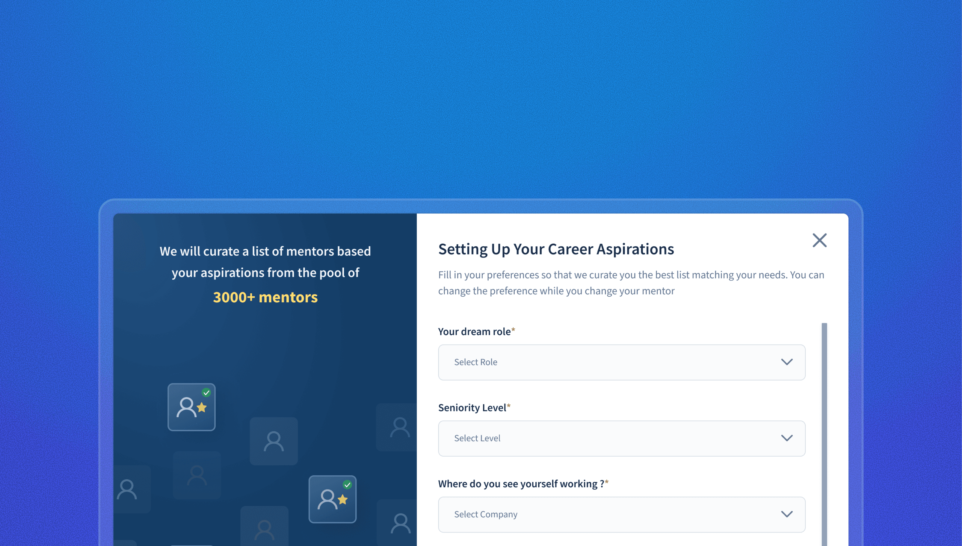
2. Career Aspirations
The old model matched learners using data Scaler already had on file. It never asked the learner anything, so the mentor they ended up with never felt like their own choice.
I added four questions about where they want to end up: dream role, seniority, target company and years in tech. Those answers are what the shortlist gets built from.
Why it was built this way
- To encourage learners to complete the form, I added an illustration on the left explaining why they need to fill out the form.
- The answers feed straight into the matching. The learner has already said what they want, so the next screen reads as a reply rather than a list.
3. Lazy Loading State
Four cards fill in one at a time, and each one names a preference the learner just gave along with the rule being applied to it. I was utilising the Labour Illusion law here.
Why it was built this way
- By default, the mentor-mentee matching algorithm is extremely fast and doesn’t take any time to load.
- Making users wait for something they requested while showing them how it is being prepared creates the appearance of effort.
- Users are usually more likely to appreciate the results of that effort.
4. Informative Mentor Cards
The earlier direction ranked mentors with a star rating, which tells a learner that a mentor is good but not that they are the right fit for them.
Why it was built this way
- The mentor card contains details on tech YOE, their education, career journey, mentees mentored, top skills and their mentor pitch on how they can help the mentees.
- I checked every one of these against what came out of the UXR meetup.
- I also added a FOMO element, “Few slots left”, to help learners make a quick decision.
- The scarcity badge is the second pressure device in a five-step flow.
5. Selection Confirmation
Selecting a mentor used to be where the flow ended, which left the learner holding a name and no real reason to do anything with it.
Why it was built this way
- I wanted to convey when a mentor session can be taken, and how to keep in touch with the mentor.
- I added a small nudge from the mentor to drive learners to book a session with them.
- This section is kept conversational, and the line “Hey …” is also customised.
6. Session Confirmation
Why it was built this way
- In the confirmation screen the focus was on improving glanceability.
- Parameters that matter to the learner, “Date”, “Duration” and “Language”, are placed together as one chunk.
- I also added “What can you expect from the mentor” to clear any confusion from the learner’s mind.
Impact
post release
~91%
Drop in support tickets about mentor matching. 234 in May 2023, down to 21 by July.
91%
Of mentees selected their own mentor. Academy, June 2023, with no ops chasing.
28% 80%
Learners who kept the same mentor for their follow-up session. DSML, either side of the May launch.
34% 27%
Refund requests on Academy. At ₹2.5L a program, about ₹17.5L retained per 100 learners.
Where I would take it next
- Improve the chat experience so the conversation carries between sessions. Selecting a mentor is solved. Keeping mentor and mentee talking in the gaps is not.
- Trigger in-product nudges off the signals that matter. When a learner's PSP drops or attendance falls away, that is the moment to push them towards their mentor, rather than waiting for them to ask.