First, a little context
About Scaler
Scaler is a technology education platform that helps working professionals build industry-relevant skills through structured programs, mentorship and career support.
Overview
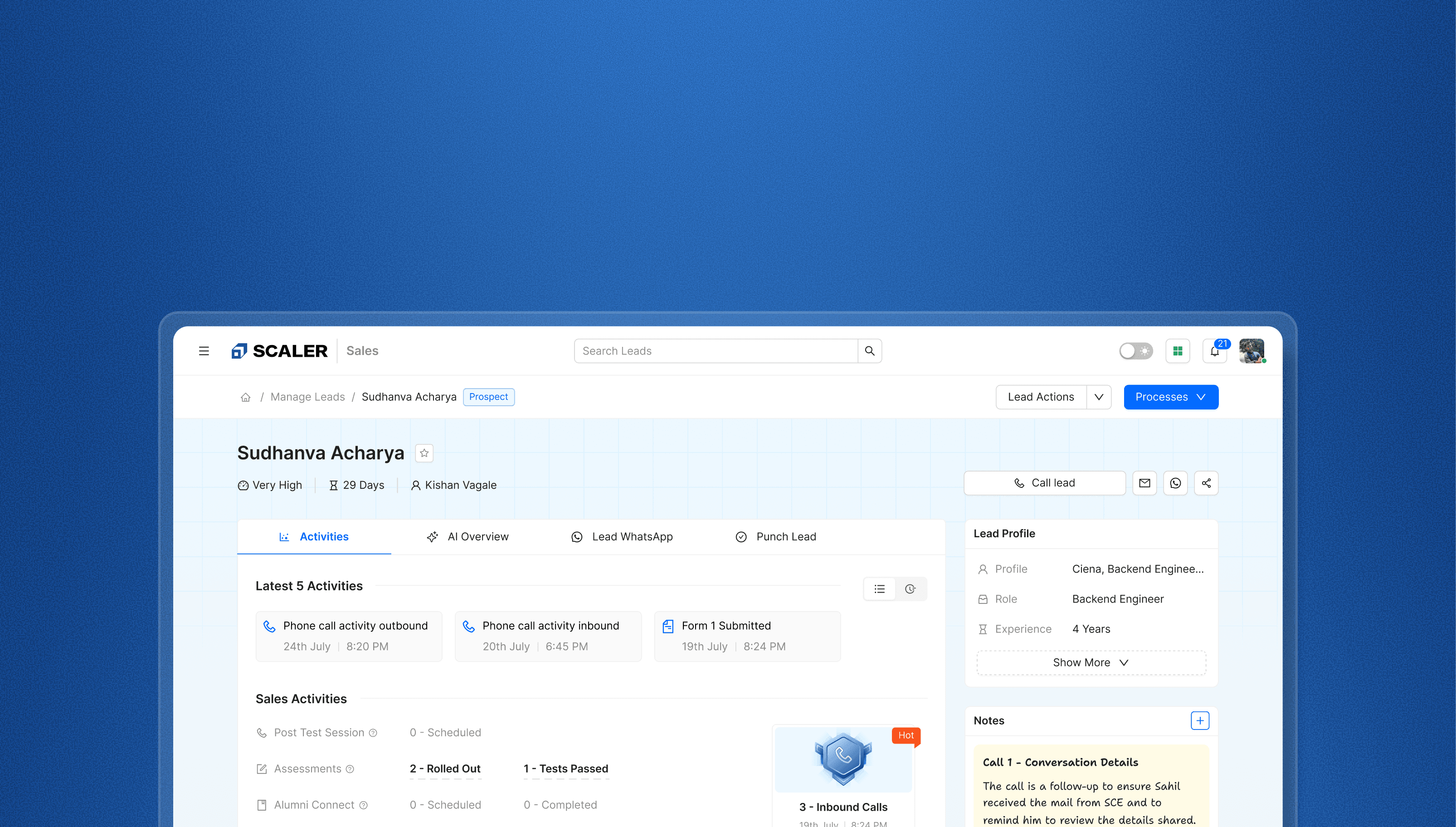
Scaler replaced its external CRM with an in-house platform, then redesigned Lead Details so sales reps could understand a lead's intent and context before every call.
My role
I was a PD1, working alongside Kishan. I independently owned the CRM Lead Details redesign.
Team


Outcomes
₹5 Cr/year
Vendor cost removed by the broader CRM initiative
7.5 → 8.2
CRM-wide CSAT from approximately 200 BDAs
100%
BDAs migrated by March 2025
Scaler needed more control over its sales CRM
The CRM sat at the centre of Scaler's sales workflow. Teams used it to understand prospects, prepare for conversations, record outcomes and move prospective learners towards enrolment.

Business Development Associates
Understand leads, make calls and update outcomes.

Sales Managers
Review pipelines, support reps and guide follow-ups.
By mid-2024, Scaler needed new capabilities from its CRM. The external vendor quoted ₹1 Cr for the upgrade, on top of the ₹5 Cr annual subscription. An in-house build was estimated at ₹80L to ₹1 Cr, making ownership the more sensible long-term choice.
₹6 CrPotential total
External CRM
₹1 CrEstimated build
In-house CRM
I was one of nine people who rebuilt the CRM. The broader initiative replaced the recurring ₹5 Cr vendor contract with an internally owned platform.
Moving from an external CRM to an in-house platform
Sales reps depended on the external CRM every day. We first recreated its core workflows so they could migrate without relearning their jobs.
The lead designer and I split the platform modules between us. We kept the workflows reps already knew. We then improved filters, lead-stage colours, automations and dark mode.
1–2 of 5
Although the migration succeeded,
the Lead Details page still slowed BDAs down
The existing page treated every call, form submission and system event equally. To understand a lead, a BDA had to scroll, open individual activities, read the details and mentally combine the signals.

Four issues created this problem
Signal was buried in noise
Routine system events and high-value intent signals carried the same visual weight.
Notes were hard to recover
Reps had to reopen old call activities to understand what happened before.
AI insight was hard to scan
Background, objections and next steps appeared in dense blocks of text.
Actions were fragmented
Contact details and frequent actions were spread across the page.
What we heard from sales leaders and reps
During discovery, I interviewed approximately 15 AVPs and sales managers and spoke directly with around 10 BDAs. Sales leaders helped me map the workflows they observed, while the people doing the calling described the same workflow in their own words. Their concern was not missing data. It was the effort required to interpret it.
Below are the synthesised notes from those discussions. They represent recurring themes rather than verbatim quotes.
BDA notes
BDA note
Like the old CRM, this page has too many buttons. Can we simplify the actions we use most?
BDA note
We work fast. The right information needs to be easier to find.
BDA note
We use AI insights before calls, but the current blocks take too long to read and interpret.
Sales Leaders Notes
Sales Leader Note
Reps need clear contact details, quick context and actionable prompts in one place.
Sales Leader Note
Most of my reps use the CRM only to fetch contact details, not to understand the lead.
Sales Leader Note
Strong intent signals are present, but they are buried among routine activity.
“Create a single-screen interface tailored specifically for sales execution. Remove non-sales distractions and place useful context exactly where reps need it.”
Constraints I had to work with
01
Keep the existing taxonomy
Sales had just migrated and knew the existing terminology. The Sales Head had already defined the Sales, Marketing and Product categories. I kept this taxonomy and made intent easier to scan.
02
Move to production in one month
I was the sole designer and had one month to ship the redesign. I focused on the highest-friction workflow and reused the existing design system.
Redesigning the Lead Details page
Based on the interviews with sales leaders and BDAs, I followed these three design principles:
01
Prioritise action over information.
02
Show only what sales reps need.
03
Keep contact details, lead context and next steps within easy reach.
 Codex
CodexExploring multiple iterations
before arriving at the final solution
Combining activity, AI and notes ❌
The first version placed activity summaries in the centre and combined AI insights with notes on the right. It failed because the three-column layout became cramped on smaller BDA laptops and pushed important signals below the fold.
Breaking activity down by type ❌
The next version used totals, rates and the latest event for each activity type. It still failed because every added activity increased scrolling, while routine events and stronger buying signals looked equally important.
Breaking down
the final design piece by piece
1. Activity Groups made lead intent easier to scan
Problem identified
The chronological timeline gave routine system events and meaningful buying signals the same visual weight.
What I did
I kept the latest five activities on top for recency. I then grouped the full history into Sales, Marketing and Product.
How the grouping was decided
The three buckets came from the Sales Head, so the taxonomy was fixed before I started. My work was to make that structure carry intent rather than only sort events.
2. Hot Activities gave reps a reason to pick one lead first
Why I proposed it
Nobody asked for this. Grouping told a BDA what a lead had done. It still did not tell them which lead in their set to call first.
What I did
I worked with the sales and data teams to find the behaviours that correlated with higher lead-to-payment conversion. Only those behaviours are promoted to a Hot Activity and given a badge. Passing the entrance test, requesting a call back and downloading the placement report all qualified.
Why a badge
The badge does two jobs. It helps a rep prioritise one lead over the rest of the set. It also gives the rep a visible win for the work that moved the lead.
Where it landed
This was my own addition to the brief. Sales leaders backed it and asked for it in the build, so it shipped with the redesign.
3. Notes brought earlier conversations back into view
Problem identified
Manually written notes were hidden inside individual call activities and were tedious to recover during a handoff.
What I did
I moved notes into a persistent rail and styled them like the sticky notes BDAs already used, keeping earlier conversation context visible during the next call.
What it cost before
Recovering a single note meant opening the activity, reading it and closing it again, roughly three interactions each time. In the redesign that context is already on screen, so the same information costs nothing to reach.
4. AI Overview became a pre-call brief
Problem identified
The existing AI summary presented call history as a dense block of text that was difficult to scan before a conversation.
What I did
I turned it into a pre-call brief with four scannable elements: lead background and intent, transcript-derived objections, a call score and recommended next steps.
5. Primary actions became easier to reach
Problem identified
Contact details and frequent actions were spread across the page, adding friction before and after a call.
What I did
I brought Call Lead, email, WhatsApp and process actions into the top-level hierarchy so BDAs could act without searching through the page.
Going above and beyond
the brief and problems mentioned by stakeholders
6. A readable checkpoint before calling
BDAs were copying small phone numbers from the CRM, pasting them into WhatsApp and then using their phones to call.
Call Lead opened a drawer with the phone number and email in a larger format. It also surfaced AI context, giving the rep one final checkpoint before the call.
7. Clear feedback after submitting a process form
After submitting a process form, BDAs refreshed the timeline to confirm that the system had registered their work.
I added a six-second confirmation showing the automations completed by the system. A production-ready Wolf of Wall Street moment acknowledged the rep and added levity to a repetitive workflow.
Impact after release
₹5 Cr
Annual vendor cost eliminated by the broader CRM initiative
7.5 8.2
CSAT across approximately 200 BDAs. Lead Details was the only major release in this window.
100%
Every BDA moved to the redesigned page by March 2025
Reviews shared by the team
What I would do
differently next time
- Instrument the page before shipping it. We shipped this page without instrumenting it, and I treated measurement as the PM's responsibility. I would not make that trade again.
- Agree the success measure before design starts. For this page it would most likely be the time a rep needs to reach a meaningful signal, and I would ask for that tracking inside the build scope, not after release.
- Hold every surface to the standard I set for one. The AI calling work shipped with feedback capture attached, so the people relying on its output could judge the quality instead of assuming it. The rest of the page deserved the same loop.